CBS Sports Golazo Network undertook a large campaign leading up to the 2026
World Cup. Though CBS was not broadcasting any of the games, it's presence was felt through comprehensive non-stop coverage, effective marketing and consistent visuals.
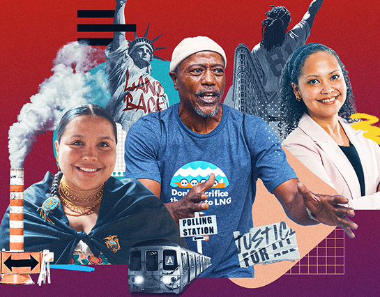
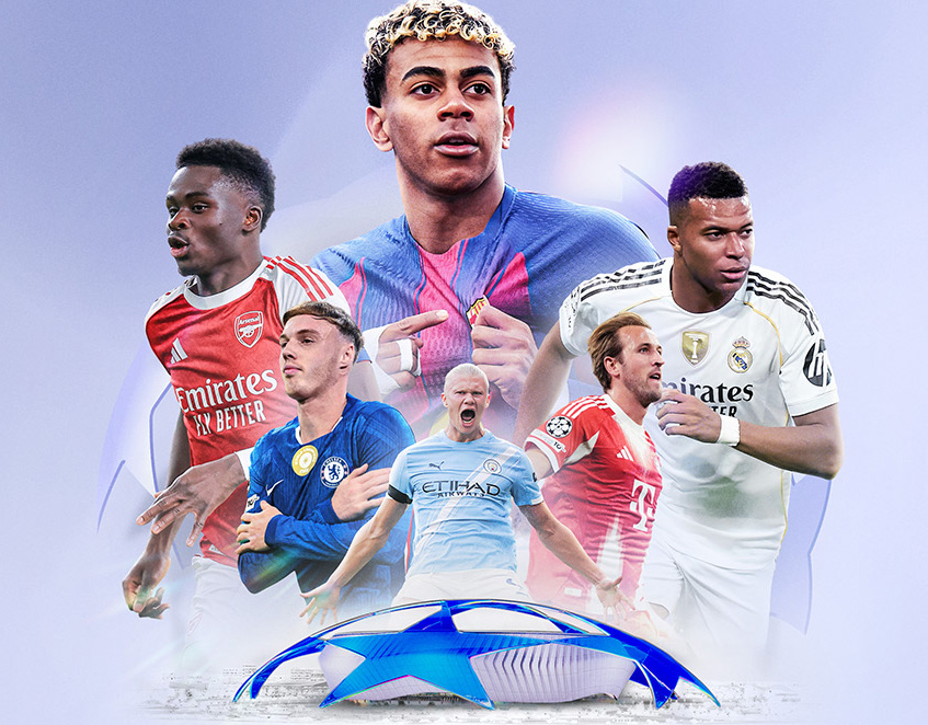
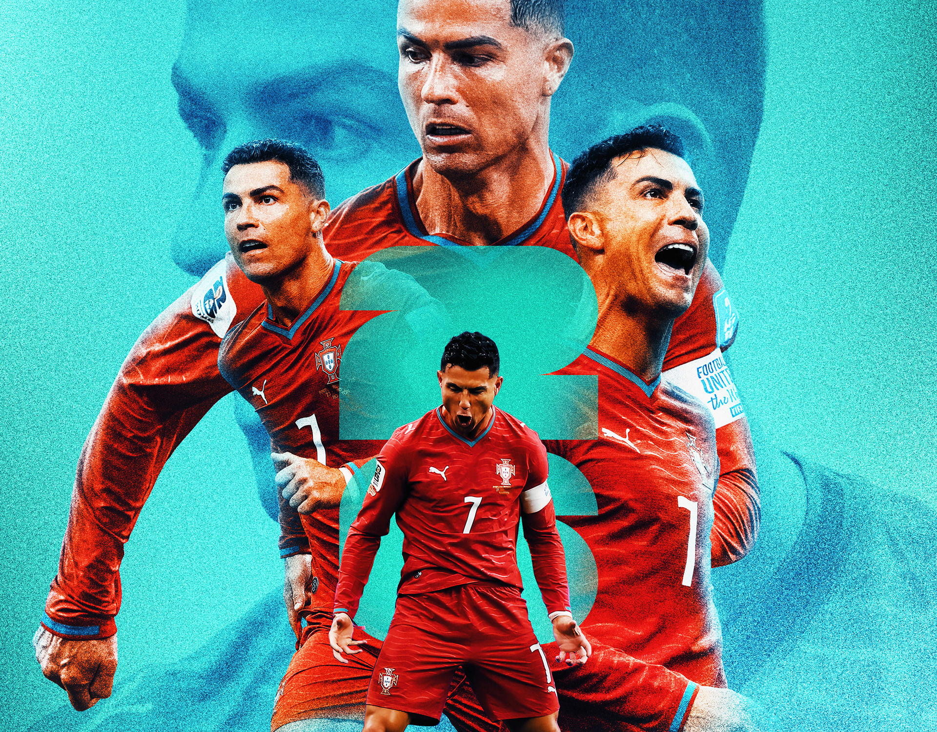
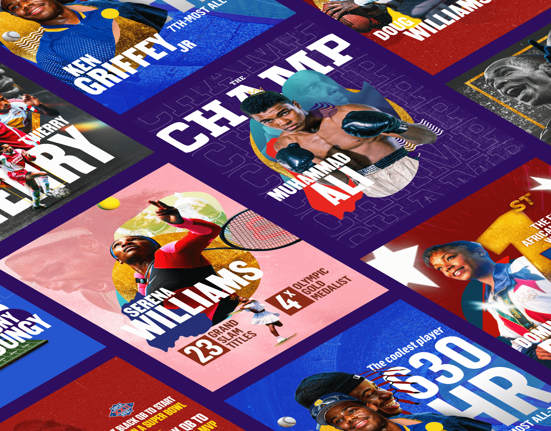
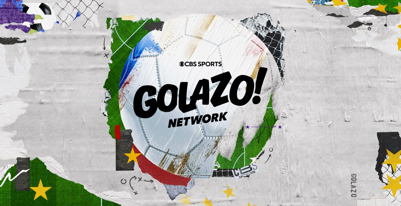
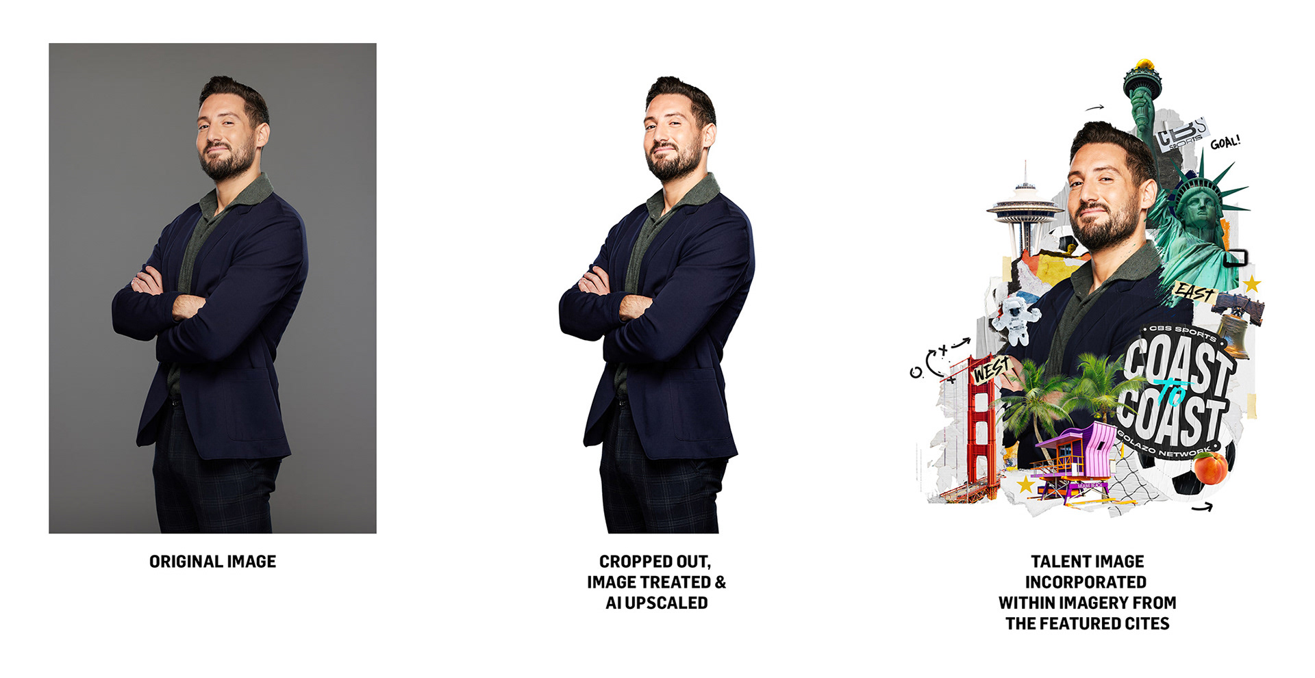
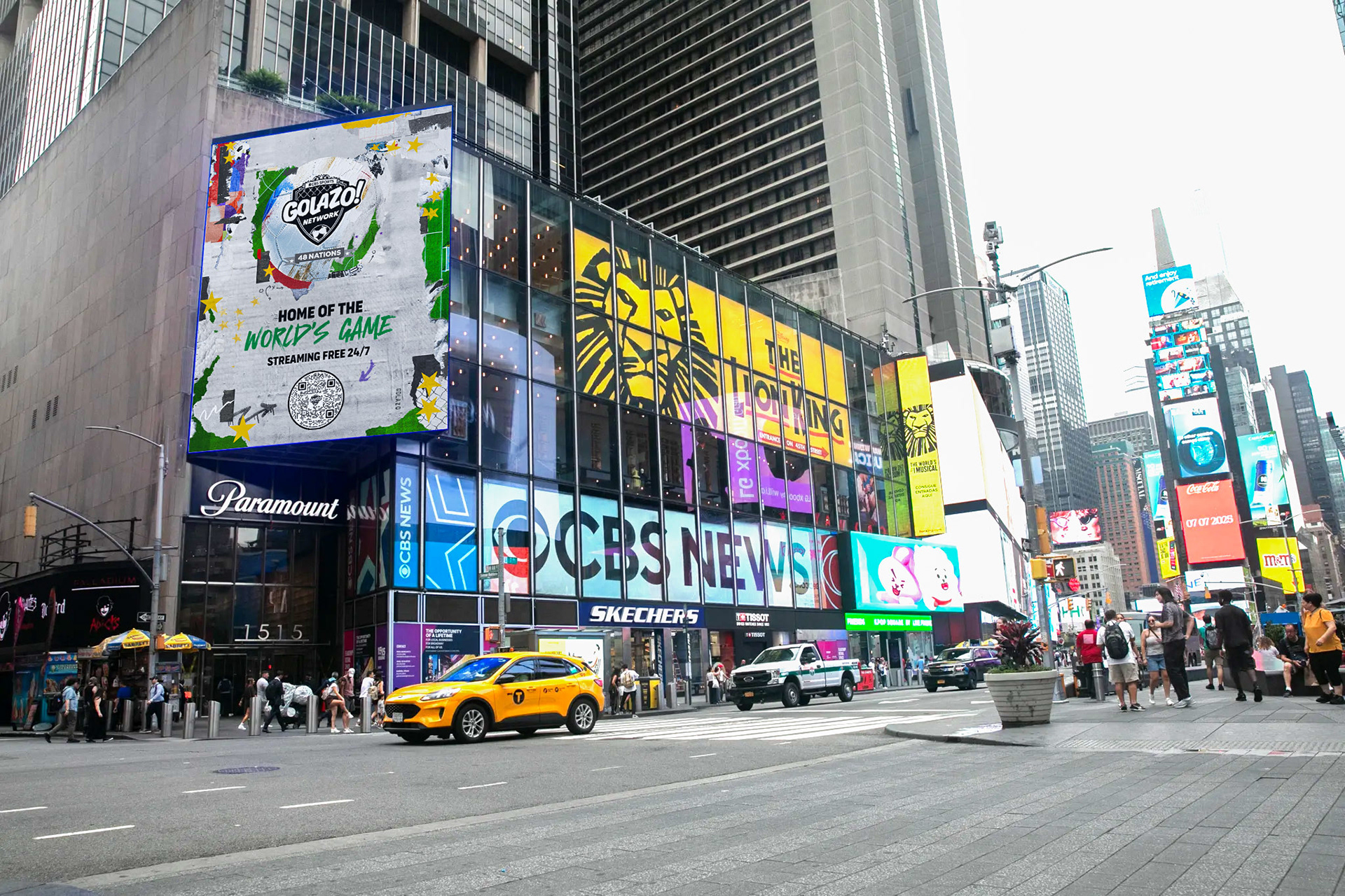
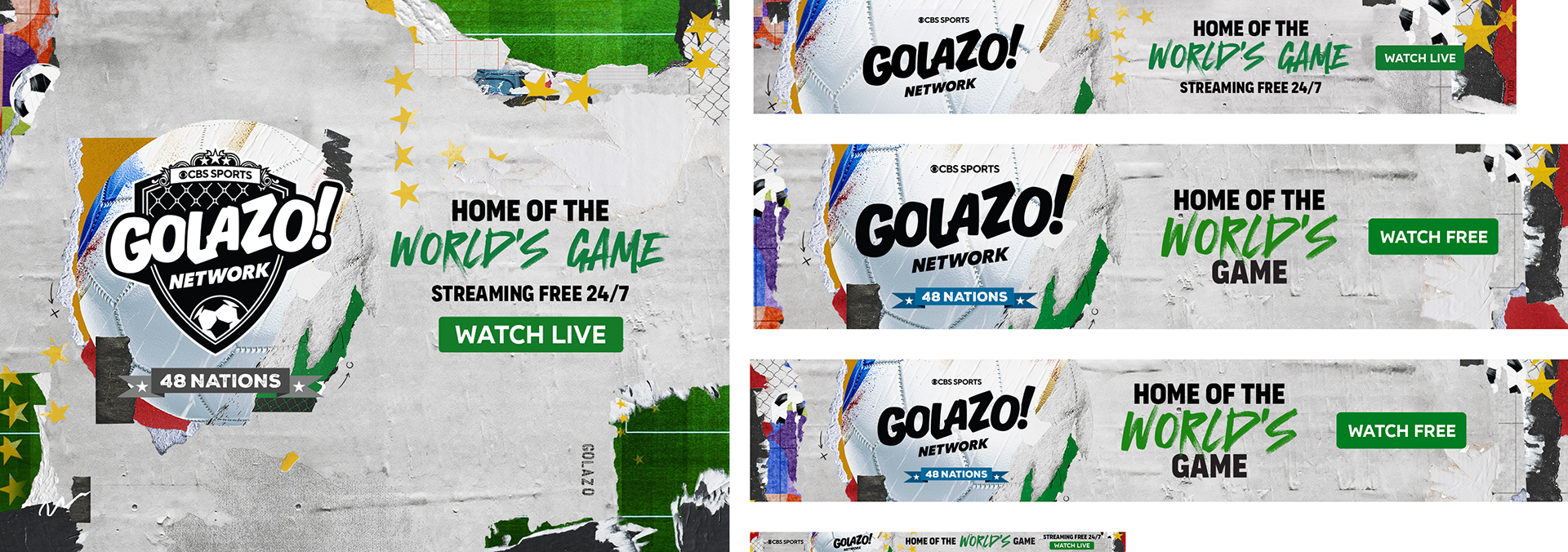
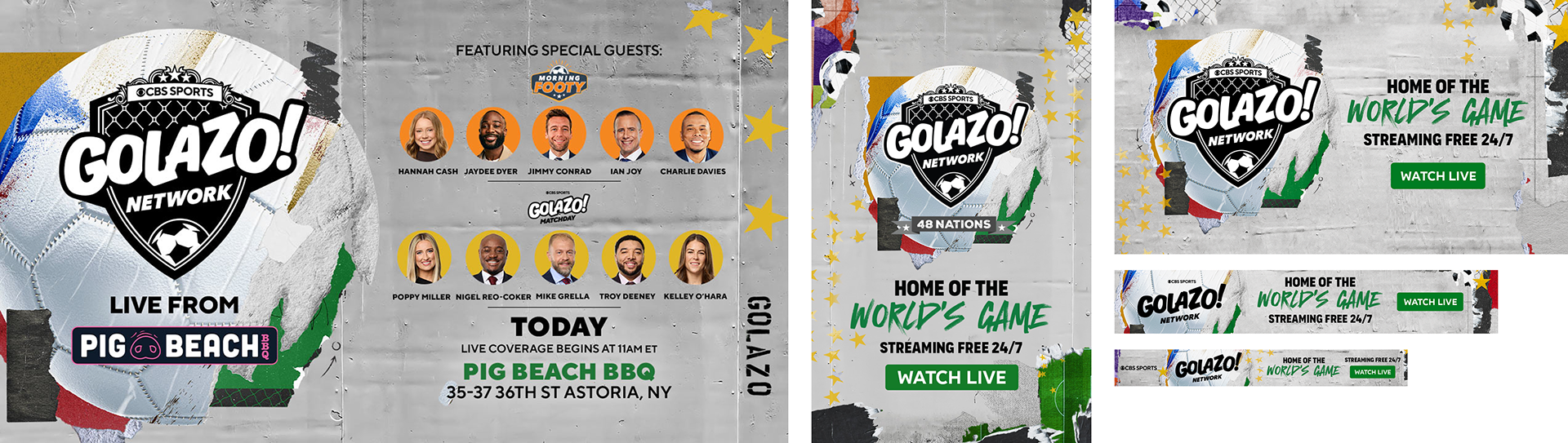
Working closely with the marketing team to understand goals and over-arching vision for this campaign, it lead me to the art seen here. Though this was something that started of small, it grow into a massive campaign. The torn paper, stars and various other elements gave this legs to continually grow and shape-shift depending on placement without losing visual cohesion.
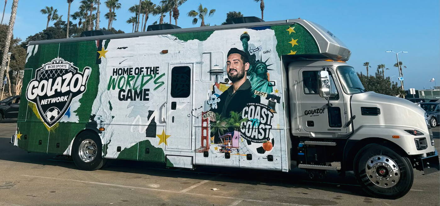
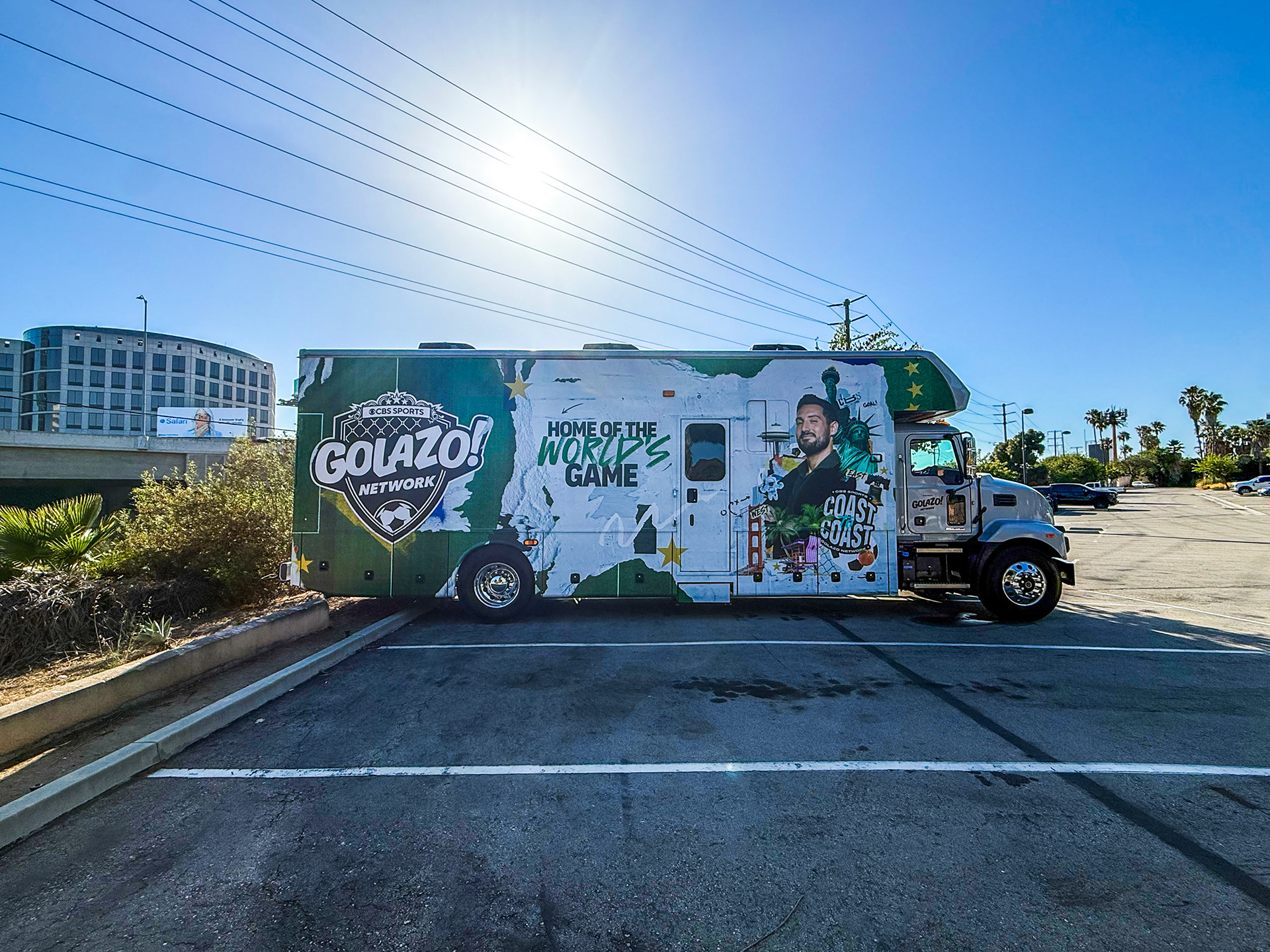
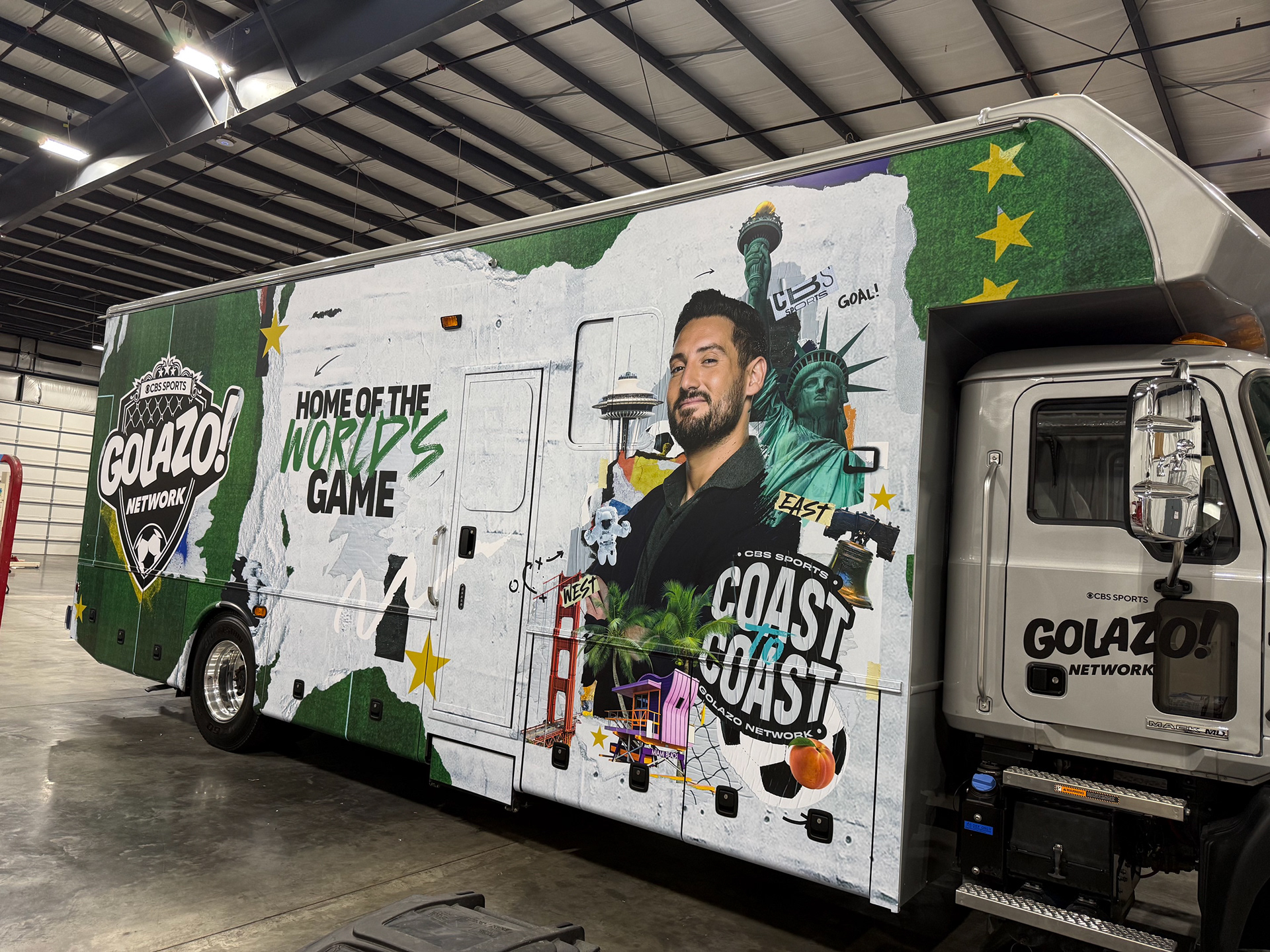
There were multiple parts to this. First was an RV that was traveling across the United States during the tournament. A look and branding needed to be established that would be
eye-catching and resonate with soccer (football) fans while also telling the story of what this RV actually was.
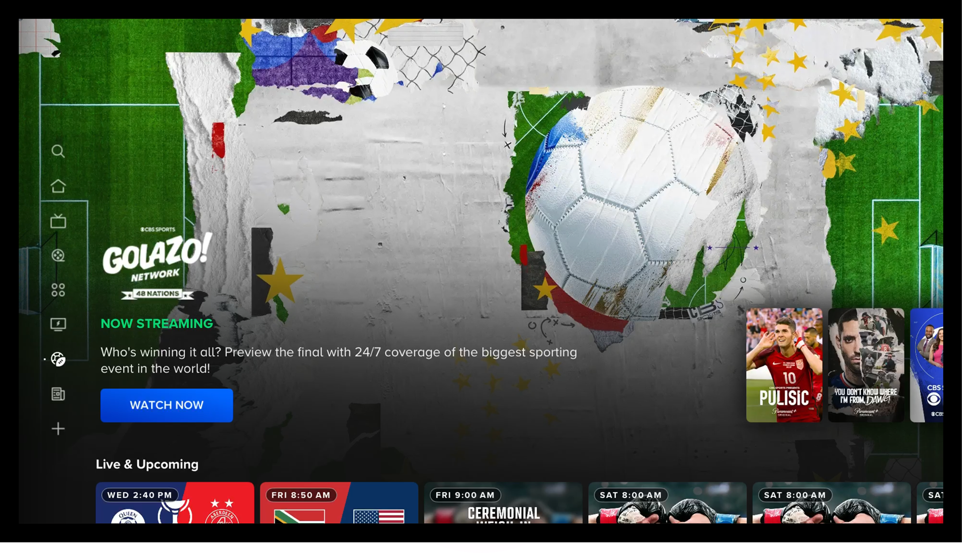
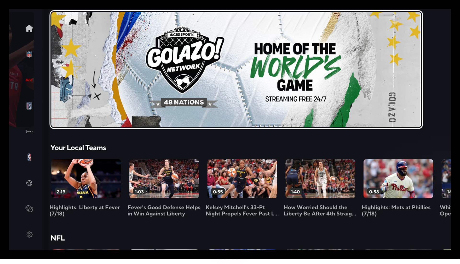
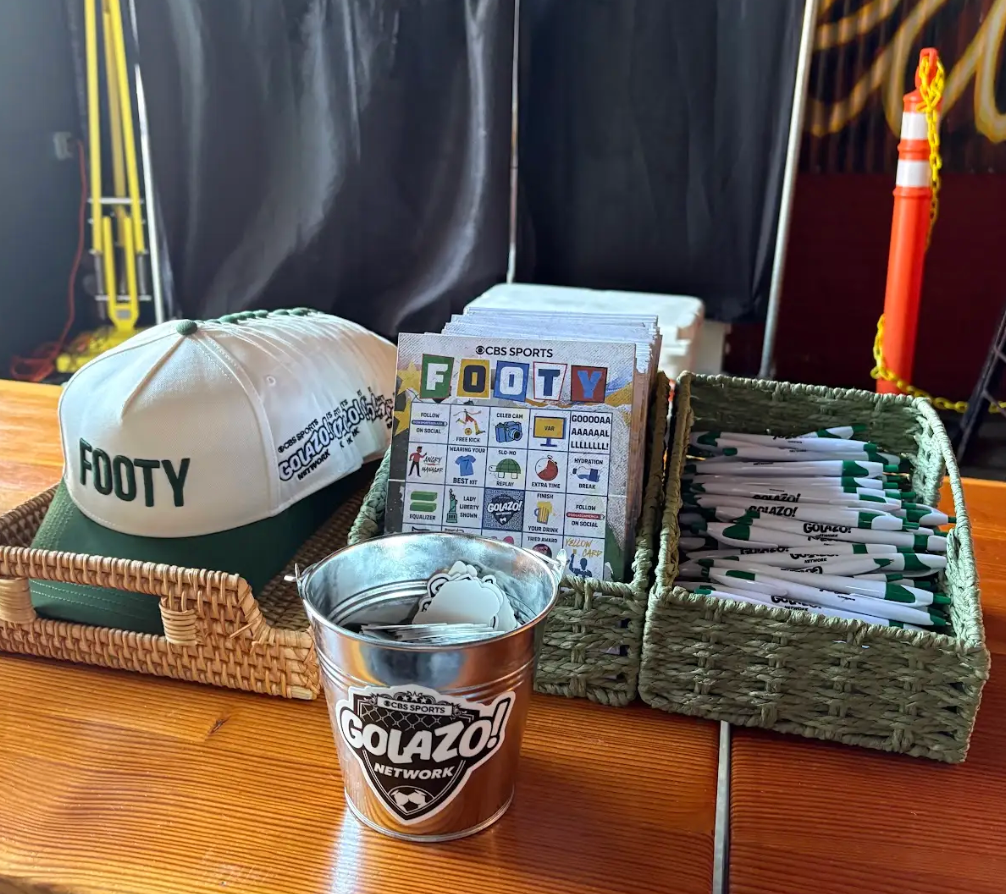
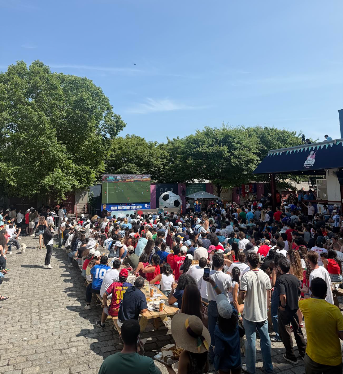
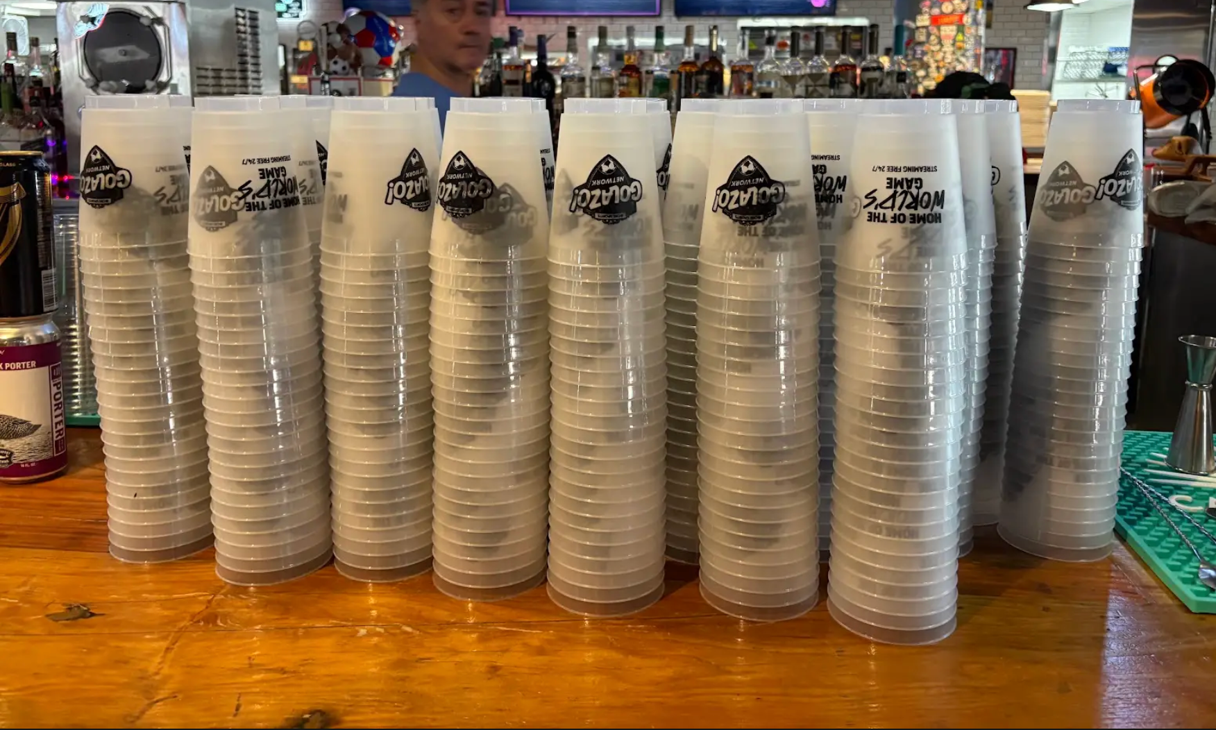
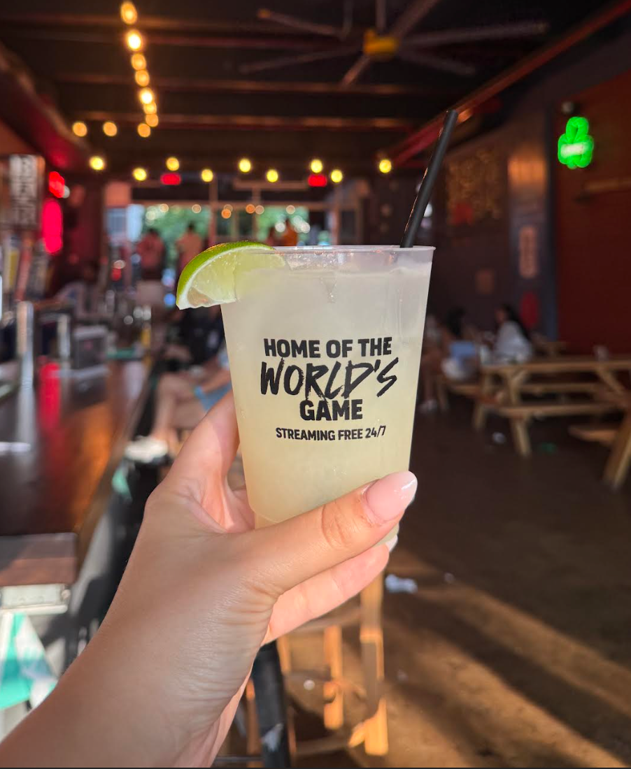
From there, came various graphic assets created that ranged from streaming backgrounds, on-air and digital banners, ephemeral printed items.
LOGO EXPLORATIONS
There were 3 names that were considered for this cross-country traveling segment.
Initially, I leaned into the Route 66 look as I felt it was a familiar mark that would be recognizable and work with the idea of driving across the nation. Once the name was changed to Coast To Coast, I drew up some other concepts. Below are some logo explorations I created before landing on the version that was approved by all teams.
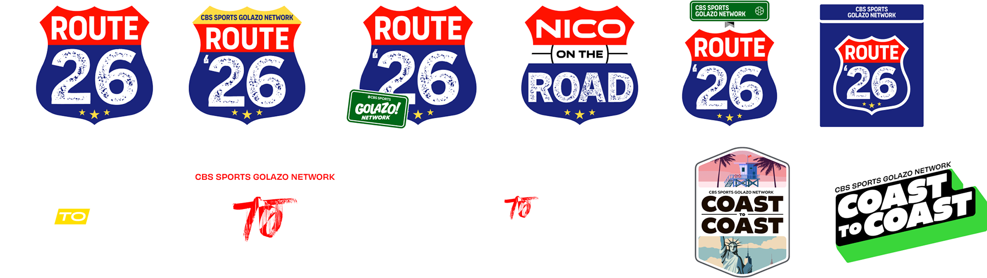
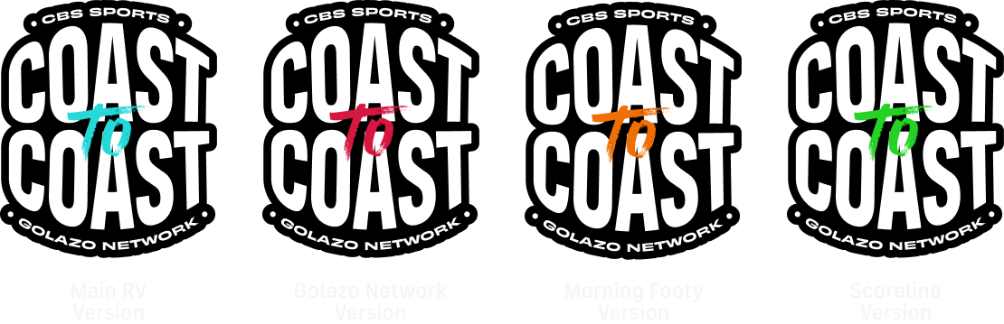
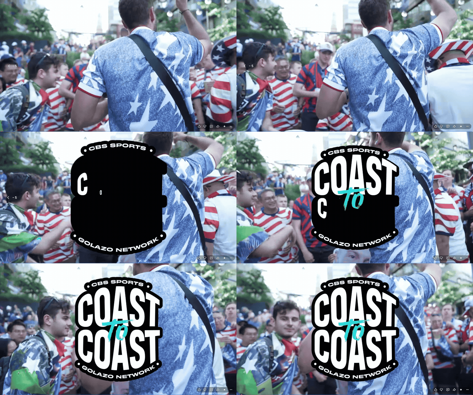
Above are where the logo landed for this 41 days journey across the U.S. I created the mark and incorporated it within the art composite. I created slightly different versions to align with the different shows that would be showcasing this in their segments.
I worked on some visual exploration for the RV in tandem with the logos due to a short
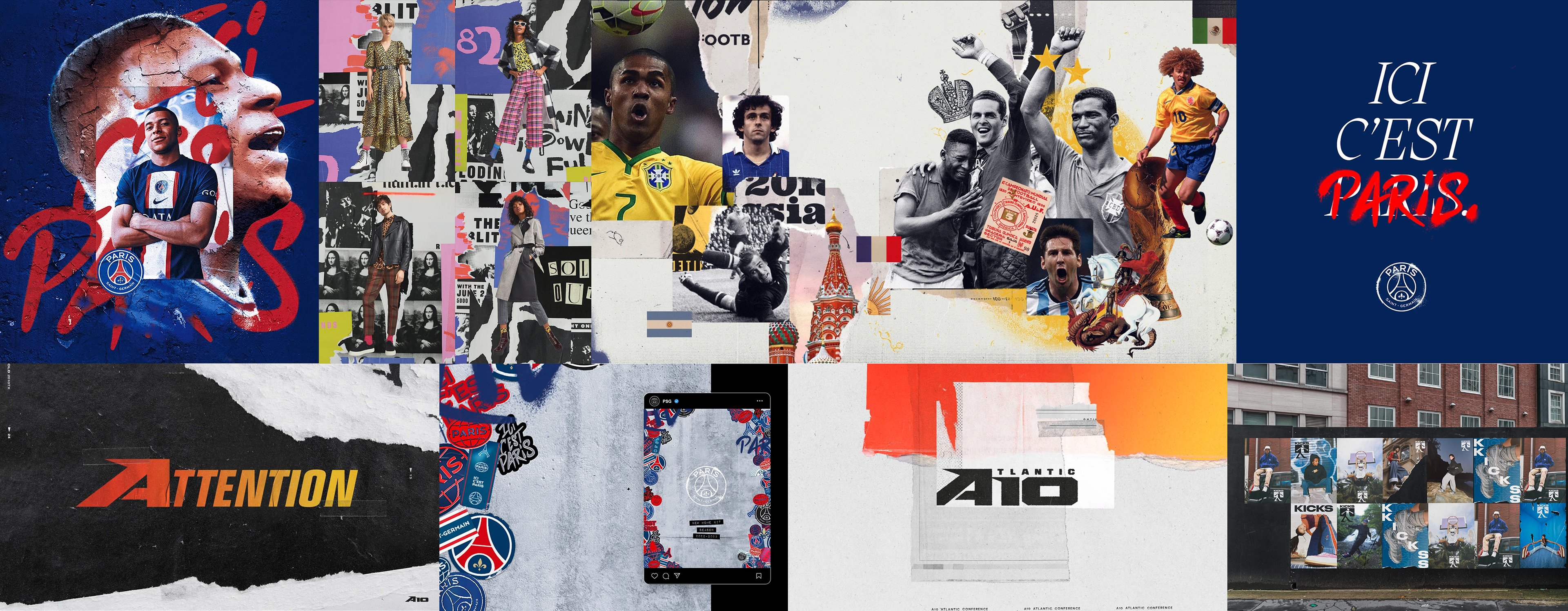
turn-around time. The overall composite look was derived from a previous Golazo Network project I had worked on. The concept of the torn paper, wall background and stars came from a desire to make this feel international, vibrant and colorful. Papers are torn to reveal a pitch player are ready to fight for their countries on. The stars represent that coveted status of a world cup winning nation.
turn-around time. The overall composite look was derived from a previous Golazo Network project I had worked on. The concept of the torn paper, wall background and stars came from a desire to make this feel international, vibrant and colorful. Papers are torn to reveal a pitch player are ready to fight for their countries on. The stars represent that coveted status of a world cup winning nation.
MOODBOARD
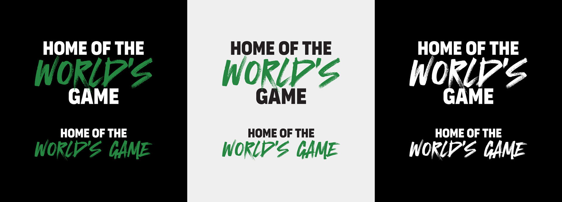
TYPOGRAPHY

DESIGN
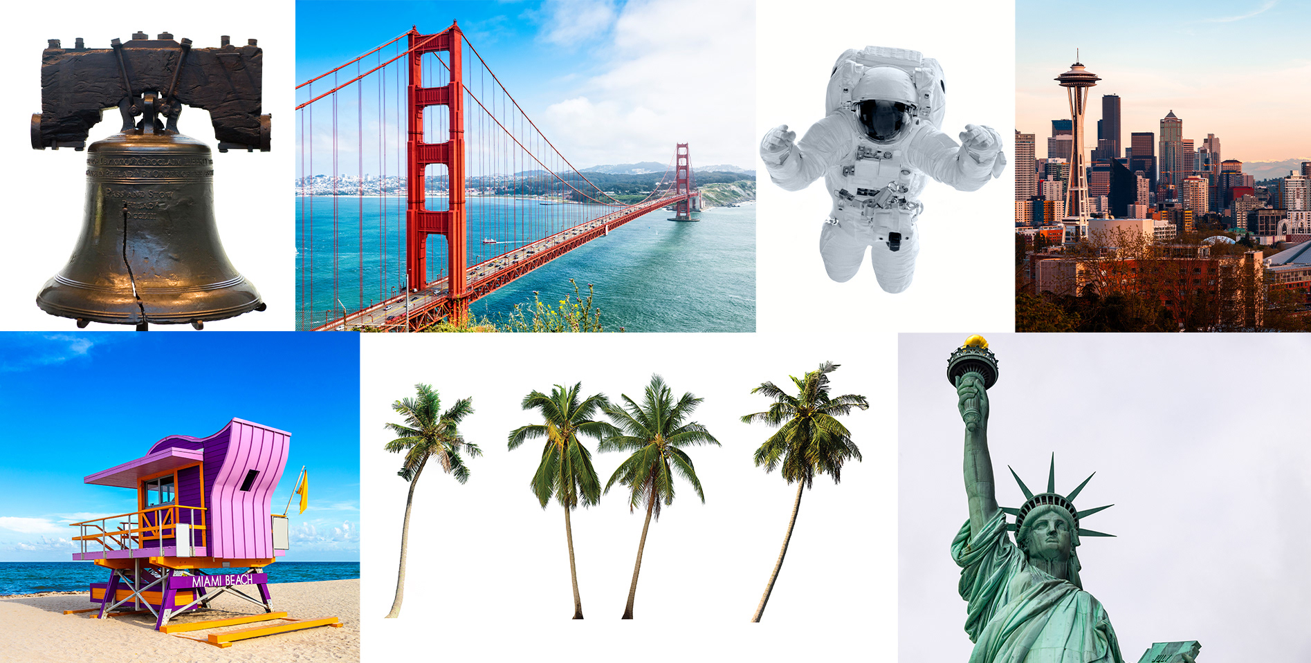
SOME USED STOCK IMAGERY
FINAL DESIGN
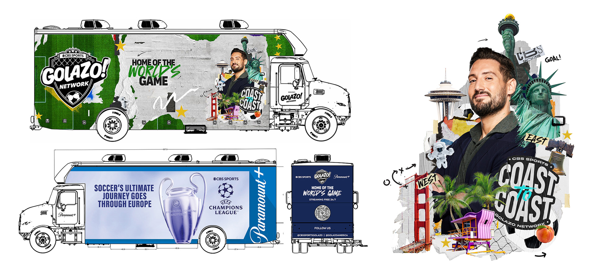
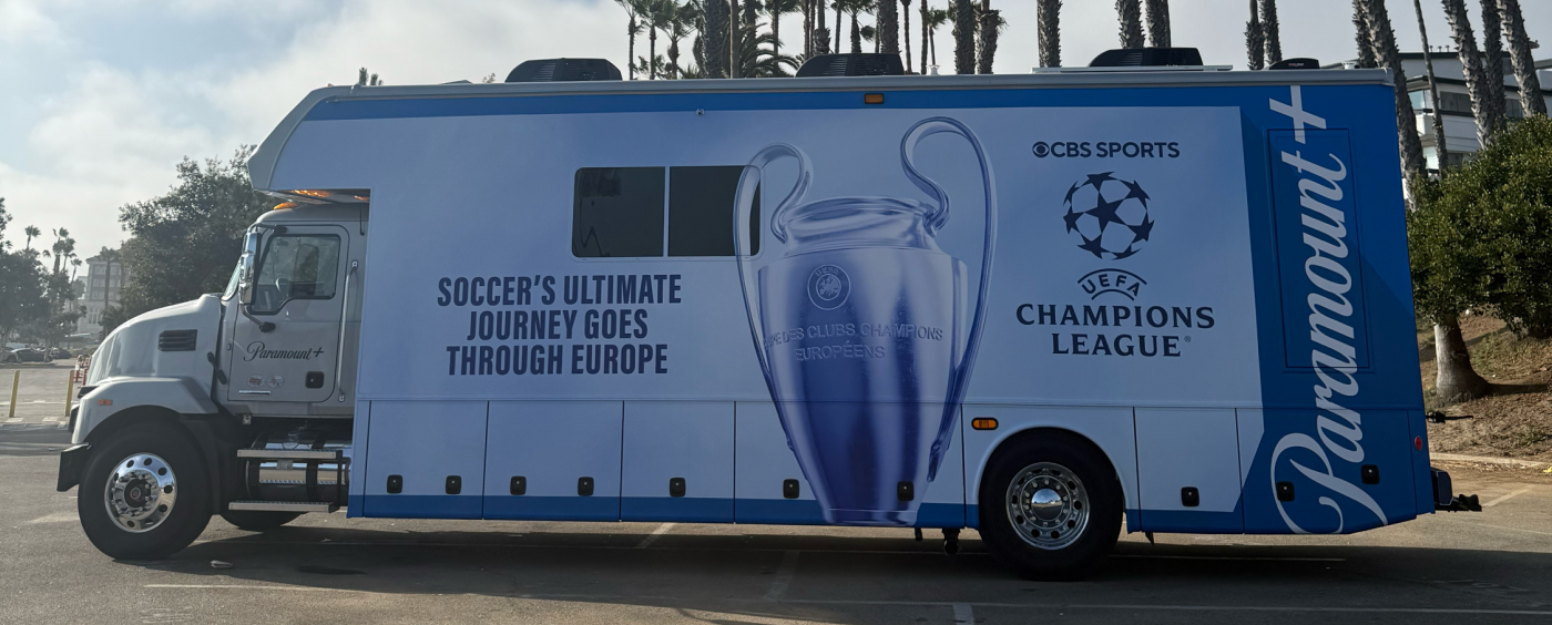
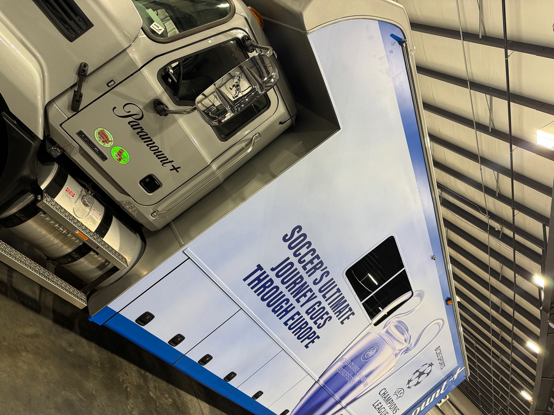
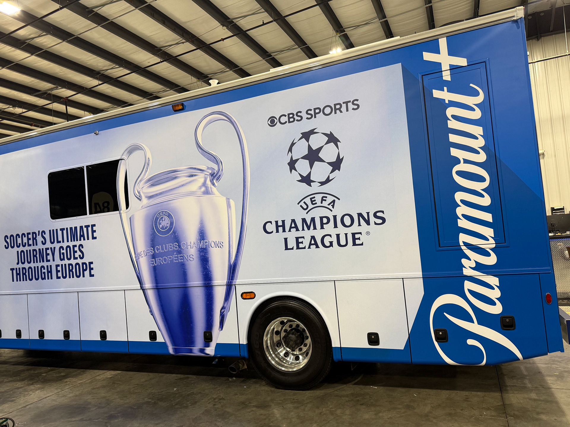
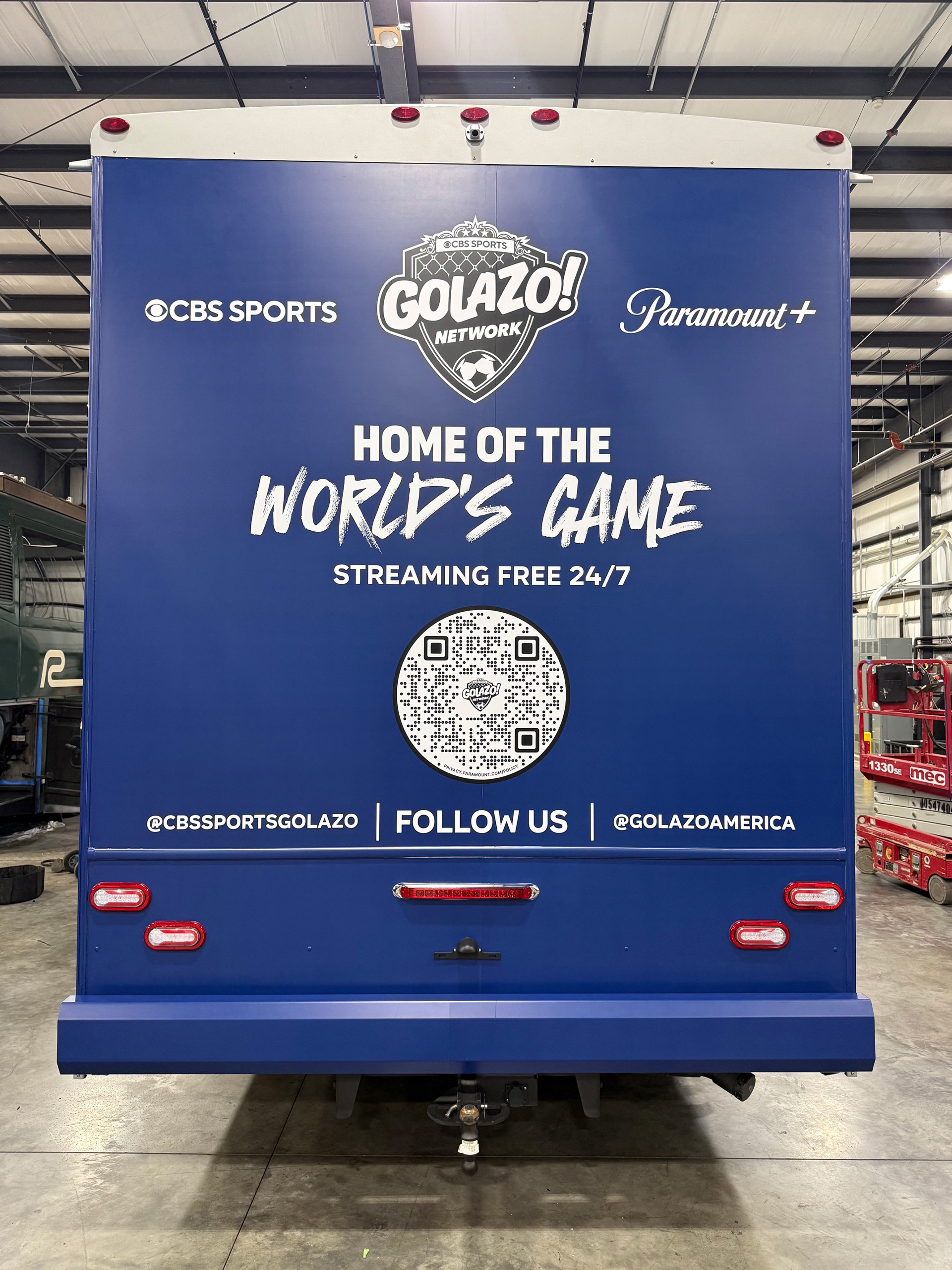
The art was segmented. On the passenger side was the art promoting the Golazo Network's Coast To Coast. The other side, I worked with the Paramount+ team that wanted a design similar to billboards that team has worked on previously. Something simple that would promote the new season of the Champions League, while the back provided social destinations and how to watch the free, soccer focused network.
PRODUCTION
DIGITAL & PRINTED
With special thanks to:
Marketing Leads: Laura Resnick, Caroline Davenport & Mackie Mayo
VP, Sports Marketing Art & Design: Lynn McCormick
Lead Sr. Designer: Greg St Fleur Dubois
Talent Photographer: Mary Kouw
Production: Emily Gallagher & Claire Komarek